Quick Answer
The colors that attract abundance usually look rich, grounded, and well cared for rather than loud. Green, muted teal, soft gold, warm cream, wood brown, and clay tend to work well because they suggest growth, nourishment, warmth, and value without making the room feel forced.
Abundance color should feel believable in a home. If the palette looks expensive for five minutes but exhausting by evening, it is not doing the room any favors.
In feng shui, abundance is not just about money colors. It is also about how a room feels. A space that feels alive, generous, and well supported usually leans toward colors that suggest growth, warmth, good light, and enoughness. That is why a calmer palette often works better than a more obvious one.
The Abundance Colors That Feel Best in Real Rooms
The most useful abundance palette directions
These shades usually feel richer and more grounded than the louder versions of the same idea.
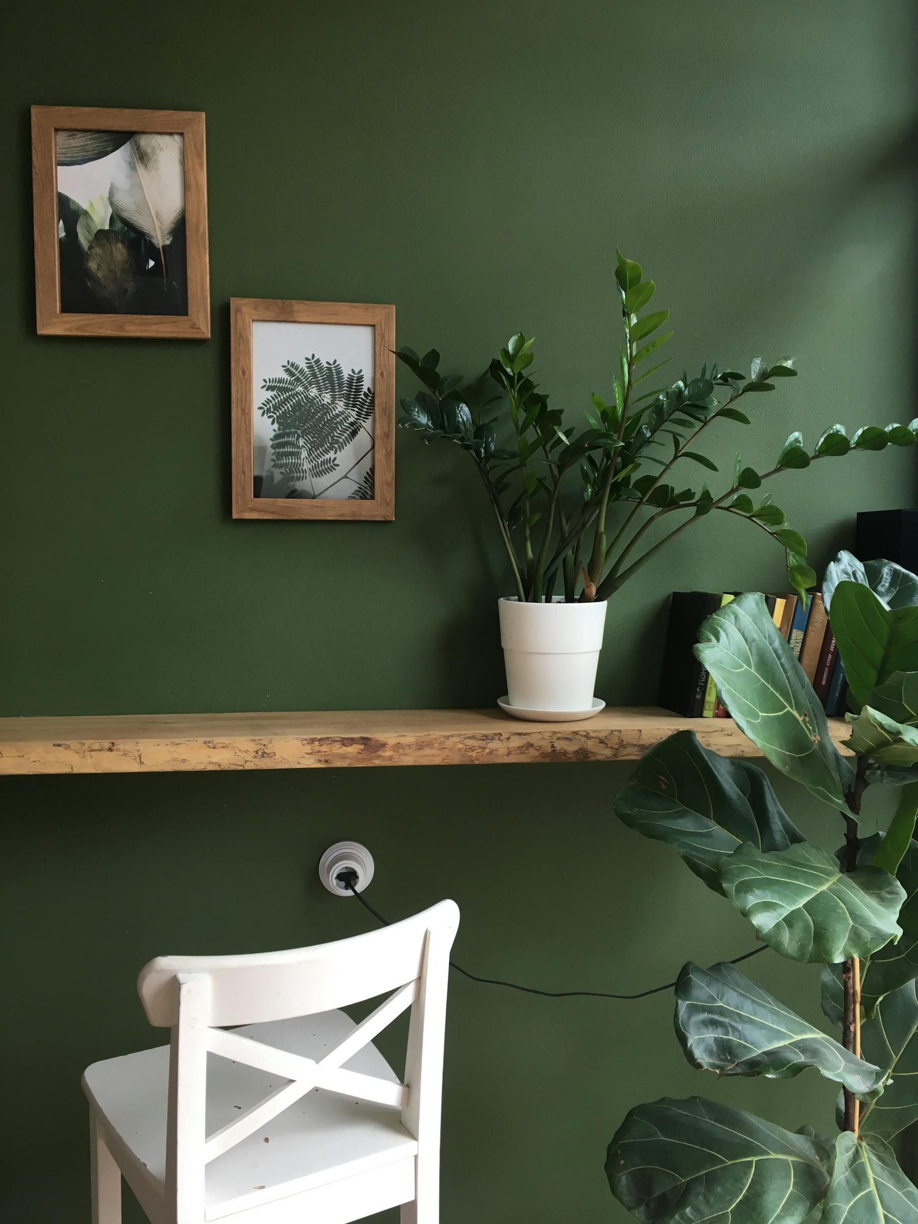
Forest or jade green
Growth and vitality
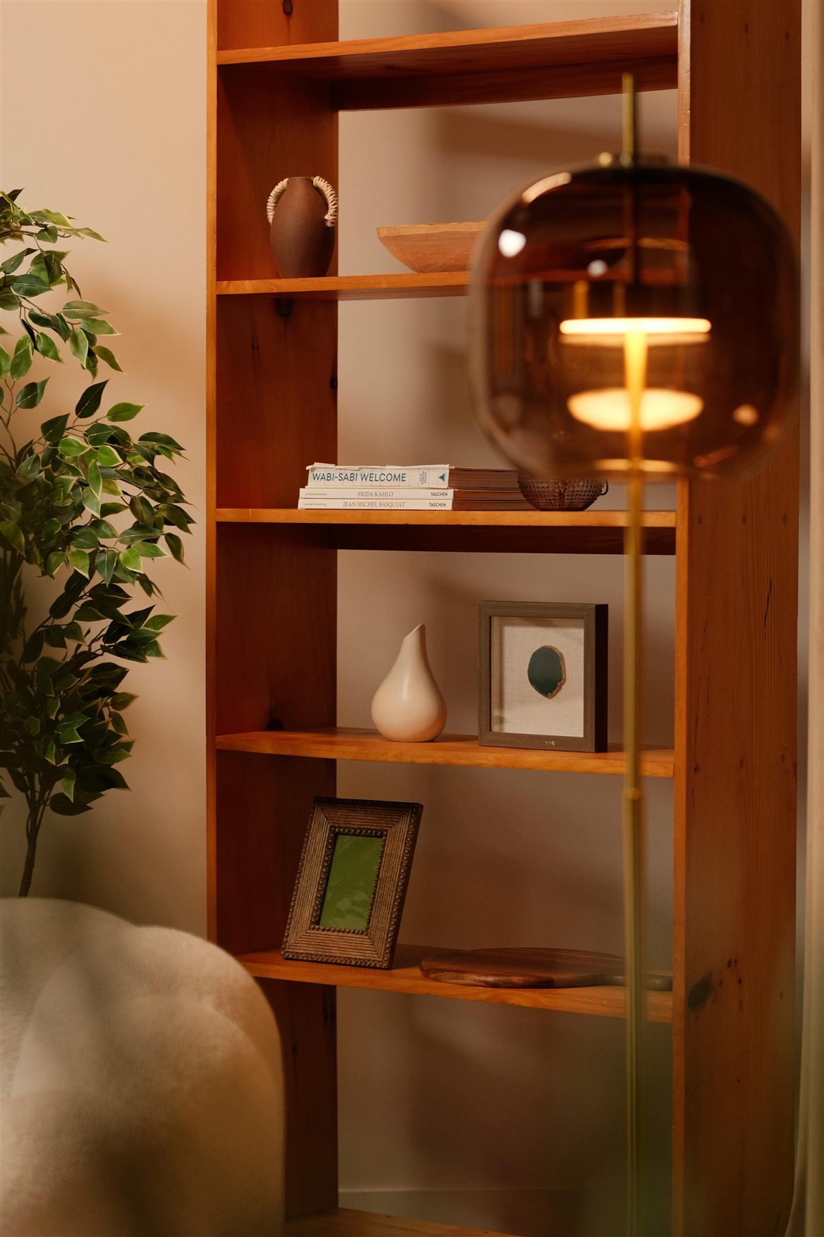
Forest or jade green + Cream + Walnut
Strong for cabinetry, painted furniture, a deeper wall, or a few anchor pieces that need to feel alive.
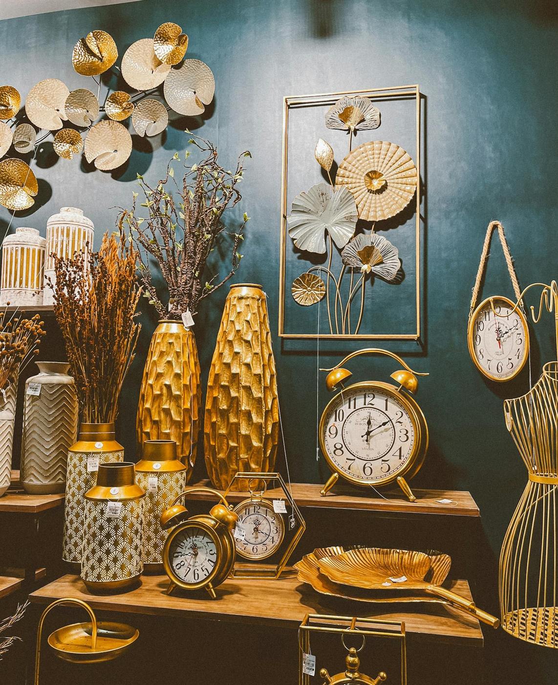
Muted teal
Flow with richness
Muted teal + Soft gold + Greige
Works when you want a cooler abundance color that still feels settled rather than sharp.
Soft gold
Value and warmth
Soft gold + Forest green + Cream
Best in smaller doses through metal finishes, lighting, or art rather than whole painted surfaces.
Clay or terracotta
Warmth and nourishment
Clay or terracotta + Oat + Wood brown
Strong through ceramics, pillows, art, and smaller color moments that keep the room from feeling cold.
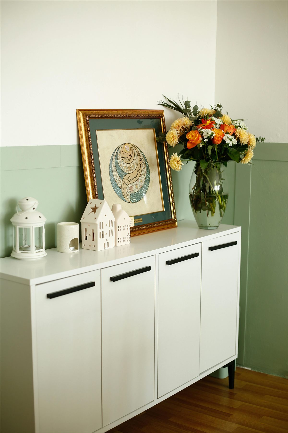
Warm cream
Breathing room
Warm cream + Teal + Gold
Important when richer abundance colors need a softer base to land on.

Green is one of the easiest abundance colors to use well because it already suggests life, growth, and continuity. If you want to take that idea further through decor instead of wall color, the most natural companion read is usually feng shui items for wealth.
Three abundance palettes that feel richer in a real room
Grounded prosperity
Forest green + Cream + Walnut
A dependable formula when you want the room to feel calm, valuable, and quietly layered.
Soft value
Cream + Soft gold + Clay
Good when you want more warmth and a little metal without pushing the room too hard.
Cool abundance
Muted teal + Greige + Soft gold
A better fit for brighter homes where deep green alone might feel too heavy.
How to Use Abundance Colors Without Forcing the Room
A room usually feels stronger when abundance color has a job. Let one tone carry the main mood, let one supporting tone add depth, and let the warmest or brightest color stay in smaller doses. That is the same principle behind feng shui positive energy items: one or two strong signals are more convincing than many scattered ones.
Give each abundance color a role
Best grounding color
Green or deep wood
This gives the room a sense of life and rootedness. Use it through a wall, case piece, or large styling anchor.
Best soft base
Warm cream or oat
A softer base gives richer abundance colors space to breathe so they do not feel heavy.
Best accent color
Soft gold or clay
Accent tones bring warmth and value, but they are usually strongest when repeated lightly instead of everywhere.
A practical abundance ratio
70% base
Warm cream or soft greige
Use this on larger surfaces so the room still feels breathable and calm.
20% support
Green, teal, or rich wood
This is where the abundance tone usually feels most convincing, such as cabinetry, upholstery, or art.
10% accent
Soft gold or clay
Keep this in lighting, frames, bowls, ceramics, or smaller styling details.
Abundance Colors to Use More Carefully
The usual abundance mistake
Avoid this
Bright yellow + Metallic gold + Hard red
A room built around shiny gold, bright yellow, and one hard red accent can feel more restless than rich.
Try this instead
Cream + Forest green + Soft gold
Bring the same idea into softer undertones so the room feels valuable, warm, and livable at the same time.
Rich does not need to mean loud
If a color only feels abundant in a photo and not in real life, it will be hard to live with. The better abundance palette usually feels steady first and impressive second.
Frequently Asked Questions
What colors attract abundance in feng shui?
Is green the best abundance color?
Can gold be used for abundance in feng shui?
What abundance colors should be used more carefully?
The Bottom Line
The colors that attract abundance are usually the ones that make a room feel alive, grounded, and well supported. Green, muted teal, warm cream, wood tones, clay, and soft gold are easier to use well than louder versions of the same idea.
Let the room stay breathable, give each color a role, and use the warmest accents with restraint. When the palette feels generous without feeling forced, the abundance message lands much better.